
Using Quark Express I made a layout of my contents page. I used the same font for the title on the magazine contents because I found the majority of magazines did this. I used the words contents to show it's the contents page.
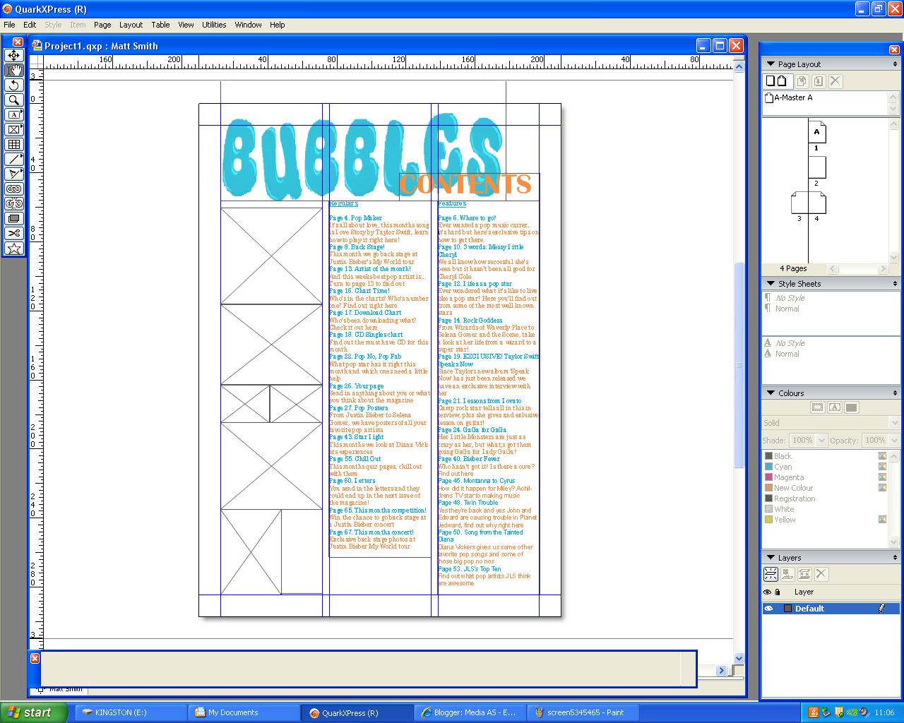
I put the page numbers and contents into two columns on the right side leaving the left side for images. I used the colors blue and orange because they are the same as the title.
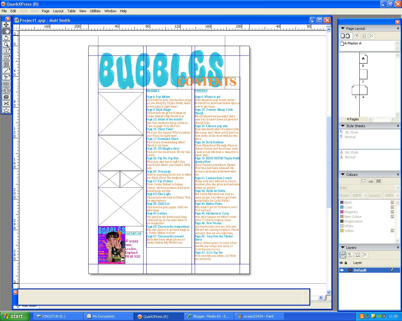
I placed an image of the front cover in the corner because I found in many other magazines they did this. I also placed contact details here because it is one of the codes and conventions of a music magazine.

I chose my images to put on the contents page. I chose the first one of the same madel as the front page to connect the two together. I chose the image of the model with the hood and three fingers up because the article is about three words. I choose the images of Justin Biebers twitter and youtube because he was found on youtube.

I added another picture of a doll similar to Lady GaGa. I added page numbers and titles to the pictures to show what page the were on.

I couldnt use this as my contents page because the title similar to the front
page was too blurry and didnt look proffesional. I needed to change the images
used and the layout giving more space for images.
FINISHED CONTENTS PAGE

This is my finished contents page, I chose to change the layout to give
more space for images and change the colors a little bit because
orange and blue were too overpowering. I chose to take the image of a model
signing a piece of paper and the hands on a Justin Bieber poster for the contents page instead.
No comments:
Post a Comment