Tuesday, 25 January 2011

Screen grabs of double page spread


Using Quark Express I copied my word document of my article to my double page spread. I chose an important quote, highlighted it and changed the color of it to break the text. I found this was one of the codes and conventions of double page spreads. I changed the font too.


I added the edited picture to cover both pages. I chose to do this because I thought the image looked good over the two pages. They also fitted in with the theme (raindrops). I highlighted the first few words to show the readers were to start reading and I also added a drop capital because this was one of the codes and conventions of a double page spread.


I placed the headline over the top of both pages in the color white to make it stand out and it was finished.


I couldnt use this for my final media product because I needed an
image that represented Cheryl Cole more I also didnt have a standfirst
of the journalist's name. The quote wasnt centered and the colors used for
the title blended in with the background therefore I had to edit this.

MY FINAL DOUBLE PAGE SPREAD


I changed the color of the headline to a blue, keeping to the color scheme of blues.
I decided to take a photograph of a hand and lipstick so it gives the effect that
the words '3 words' were being written onto the page. I added the standfirst
and changed the color of the quote to make it stand out.


Wednesday, 19 January 2011

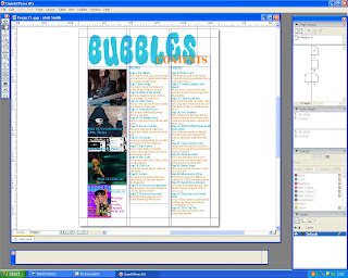
Screen grabs of contents page


Using Quark Express I made a layout of my contents page. I used the same font for the title on the magazine contents because I found the majority of magazines did this. I used the words contents to show it's the contents page.


I put the page numbers and contents into two columns on the right side leaving the left side for images. I used the colors blue and orange because they are the same as the title.


I placed an image of the front cover in the corner because I found in many other magazines they did this. I also placed contact details here because it is one of the codes and conventions of a music magazine.


I chose my images to put on the contents page. I chose the first one of the same madel as the front page to connect the two together. I chose the image of the model with the hood and three fingers up because the article is about three words. I choose the images of Justin Biebers twitter and youtube because he was found on youtube.


I added another picture of a doll similar to Lady GaGa. I added page numbers and titles to the pictures to show what page the were on.

I couldnt use this as my contents page because the title similar to the front
page was too blurry and didnt look proffesional. I needed to change the images
used and the layout giving more space for images.

FINISHED CONTENTS PAGE


This is my finished contents page, I chose to change the layout to give
more space for images and change the colors a little bit because
orange and blue were too overpowering. I chose to take the image of a model
signing a piece of paper and the hands on a Justin Bieber poster for the contents page instead.

Tuesday, 18 January 2011

Screen grabs of magazine front page


 This is how my front cover originally looked like. I had to make some changes to fit the genre. The changes I made were the outfit the model was wearing. I had to chage that because the clothes were too dark for a pop magazine. I also changed the position of the model because you could see the stand she was holding and it didn't look right. I also changed the colors slightly to fit in with the questionnaire results.


 I used photoshop to create my front cover. I chose the purple background because the questionnare results said they liked the color purple. I found the front for the front page on the internet, I chose to use it because it looks like bubbles and that's the name of the magazine so it fitted well. I edited the picture to make it look lighter and enhance the features.


I added the coverlines and chose to make them orange because the models bow was orange and the target audience liked the color. I used yellow for the word exclusive to make it eye catching and to grab the audiences attention.

I added a band of color accross the bottom of the front page which would contain the artists name which would be included inside the magazine. I chose pink because the target audience like that color.
I added a barcode because every magazine has a barcode on the front page. I also added the price and date of the issue.

Finally I changed the name of the artists on the bottom strip because they were already on the front cover. I changed the size of the barcode because it was too big and I also changed the positioning of the words 'Candy Cane' because they looked better lower down the page. I also put the models head in front of the title because in many of the magazines I've looked at it was like that.

This couldnt be used as my final magazine front page because
the font for the title found on the internet was a jpeg file
and when printed out looked blurry and unproffesional
so I changed this.

FINISHED FRONT COVER


My final magazine front cover is this. I made a few changes which were
I shoertened the coverlines focusing on the artists names. I made the
botton strip smaller, made the barcode smaller and used a different font for the title
I added a glow effect on the title to make it more eye catching to the audience
and I also made the color yellow because from the audience research I found it a color
the target audience liked.I also moved the positioning statement and issue date
and price.